I was especially interested in the line work Charlotte Farmer (http://www.charlotte-farmer.co.uk) used, and started recreating some of her illustrations and creating my own pieces inspired by her work. The work included fineliner and watercolour. I felt that I could develop this work with stitch, so I created some linear samples on calico, which created some smaller strong samples for my book. Charlotte Farmer has a different illustrative approach to her work which is why I continued with hand drawn illustrations and adding watercolour. My work from this artist is shown below.
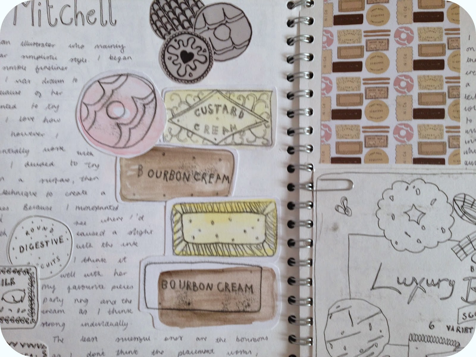
Martha Mitchell (http://www.marthamdesign.com) focused on simplistic fineliner food illustrations. The contrast between Charlotte Farmer and Martha Mitchell is shown through the difference of detail. Martha Mitchell’s work is delicate and shows a more basic style of drawing. I wanted to focus on this artist to show the basics of drawing and still make effectivles. I mainly used fineliner and mono print throughout, and created a digital tessellation which I felt was successful and developed it into a mug design. I wanted to focus on this artist to show the basics of drawing and still make effective samples. I feel I achieved this after recreating the illustrations below.
Becka Griffin (http://www.beckagriffinillustration.co.uk) creates food illustrations and introduces the typography element in the form of word play, typography is an important factor within this project that I wanted to start looking into. Whilst continuing my hand made illustrations, I also liked the prospects of typography within these pieces, and the hand drawn element. Looking at Becka Griffin's illustrations I decided to make my own through the use of watercolour and fineliner. These bright colour pallets were the key to achieving such a nice quality piece. I also created a digital tessellation created heavily inspired by her work, I used my own illustrations and typography to create this piece. I was pleased with how it turned out and showed how the pattern would work on different products.
369 words


No comments:
Post a Comment